
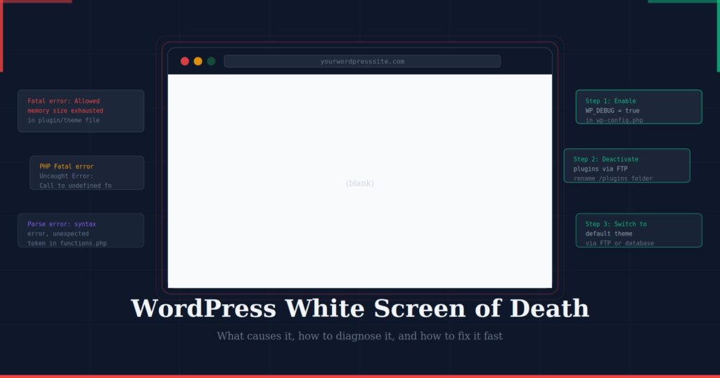
WordPress White Screen of Death: Causes, Fixes and Prevention
April 24, 2026
AI Integration for SMEs — Where to Start Without a Big Budget
June 4, 2026You build a beautiful website, check it on your laptop, and it looks exactly right. Then a colleague opens it on their phone, and the layout is completely different — text is tiny, images are cropped oddly, the navigation has disappeared behind an icon, and the three-column section has collapsed into a single vertical list. Nothing is broken. This is a responsive design working exactly as it should. But if you have never understood why it happens, it can be deeply confusing.

This guide explains the mechanics behind why websites look different across devices, what actually changes and why, and what it means for the quality of your site’s design and user experience.
The Fundamental Reason: Screen Size Varies Enormously
A website is not a static document like a printed page. It is code — HTML, CSS, and JavaScript — that a browser interprets and renders within whatever space is available. A desktop monitor might be 1440 pixels wide. A laptop screen might be 1280 pixels. A tablet is typically 768–1024 pixels. A smartphone screen might be anywhere from 320 to 430 pixels wide.
The same content has to work across all of these contexts. A navigation bar with eight links that fits neatly across a 1440-pixel desktop screen cannot physically fit on a 375-pixel phone screen. A three-column grid of product cards that looks balanced on a laptop would produce unreadably narrow columns on a mobile. Content that was designed for one screen size has to be reorganised for another.
This reorganisation is what responsive design does — and the differences you see between your site on desktop and on mobile are not errors or inconsistencies. They are intentional adaptations to different viewing contexts, controlled by rules in your site’s CSS.
What CSS Breakpoints Do

The technical mechanism that controls layout changes across screen sizes is called a CSS media query, and the specific screen widths at which the layout changes are called breakpoints. A breakpoint is a threshold — when the browser window is narrower than this value, apply these CSS rules; when it is wider, apply different rules.
A typical responsive layout has three to four breakpoints, roughly corresponding to mobile (under 768px), tablet (768–1023px), desktop (1024–1439px), and large desktop (1440px and above). At each breakpoint, the CSS rules change — column counts shift, font sizes adjust, navigation transforms, elements that were side by side stack vertically.
In practical CSS, a breakpoint looks like this:
/* Default styles — mobile first */
.grid {
  display: grid;
  grid-template-columns: 1fr; /* single column */
}

/* At 768px and wider */
@media (min-width: 768px) {
  .grid {
    grid-template-columns: 1fr 1fr; /* two columns */
  }
}

/* At 1024px and wider */
@media (min-width: 1024px) {
  .grid {
    grid-template-columns: 1fr 1fr 1fr; /* three columns */
  }
}
The same HTML element — the same div, the same content — is displaying as one column, two columns, or three columns depending purely on how wide the browser window is. No content has changed. Only the layout rules have changed.
According to MDN Web Docs’ guide to responsive design, this combination of fluid grids, flexible images, and media queries is the foundation of how the modern web adapts to different devices — a technique first formally described by Ethan Marcotte in his landmark A List Apart article that gave responsive design its name.
What Actually Changes Between Mobile and Desktop

Navigation
On desktop, navigation menus are typically displayed as a horizontal bar of links across the top of the page. On mobile, the same links are almost always hidden behind a hamburger icon (the three horizontal lines) — tapping it reveals a dropdown or slide-in panel containing the full menu.
This is not a separate mobile site with a different menu. It is the same HTML list of links, with CSS rules that hide the horizontal desktop version and show the mobile icon version when the screen is below a certain width. The transition is purely visual — the underlying content is identical.
Grid layouts and columns
Multi-column grids — product listings, blog post cards, feature sections, team member profiles — almost universally collapse from multiple side-by-side columns on desktop to a single vertical column on mobile. A four-column product grid on desktop becomes a one-column scrollable list on a phone.
This is the most visible difference between mobile and desktop views, and it is entirely intentional. Four items side by side at 375 pixels wide would each be less than 90 pixels — far too narrow to show a readable product image and title. Stacking them vertically gives each item the full width of the screen and makes the content legible and usable.
Typography and spacing
Font sizes and spacing are adjusted at different breakpoints because what is readable on a large screen is not necessarily the same as what is readable on a small one. A 60-pixel hero heading that looks dramatic on a 1440-pixel desktop monitor would take up an enormous proportion of a 375-pixel phone screen. CSS media queries scale these values down proportionally — the relative visual weight remains similar even as the absolute pixel sizes change.
Line lengths also matter for readability. Nielsen Norman Group’s research on reading on screens recommends line lengths of 50–75 characters for comfortable reading. On a wide desktop, a content column that is 100% width would produce lines far longer than this — responsive layouts typically constrain content to a maximum width and centre it on large screens, rather than stretching full-width.
Images
Images behave differently across screen sizes in several ways. On mobile, images typically stretch to fill the full available width rather than appearing at a fixed pixel size. Some images — particularly decorative background images or supplementary illustrations — may be hidden entirely on mobile using CSS, both to save bandwidth and to prioritise the core content.
The HTML srcset attribute and the picture element allow developers to serve different image files at different screen sizes — a large high-resolution image for desktop, a smaller optimised version for mobile — so that mobile users are not downloading unnecessarily large files. This is both a performance optimisation and a data consideration for users on mobile connections.
Touch vs mouse interaction
Desktop design assumes a mouse cursor — which can be positioned precisely, can hover over elements to reveal dropdown menus, and can click on small targets comfortably. Mobile design assumes touch — fingers, which are imprecise, cannot hover, and need larger targets to tap accurately.
This affects button sizes (mobile buttons must be large enough to tap with a finger — the WCAG guideline recommends a minimum 44×44 pixel tap target), the absence of hover states on mobile (because there is no hover on a touchscreen), and the removal of features that depend on hover to function — dropdown menus that only appear on hover, for example, do not work on mobile and must be redesigned as tap-triggered elements instead.
Content order and visibility
The order in which elements appear on a page can differ between mobile and desktop. A blog post layout with a sidebar on the desktop — where the sidebar appears alongside the main content — will typically show the sidebar below the main content on mobile, or remove it entirely. CSS Flexbox and Grid allow developers to visually reorder elements without changing the underlying HTML, so the same content can appear in a different sequence depending on screen size.
Some elements are hidden entirely on mobile using display: none in the CSS — decorative elements, supplementary information, or interface elements that have no functional equivalent on touch devices. This is a deliberate design decision, not a bug.
Mobile-First Design: Why It Matters

There are two approaches to responsive design: desktop-first (design for the largest screen, then scale down) and mobile-first (design for the smallest screen, then scale up). Mobile-first is the current industry standard — and understanding why explains a great deal about how modern websites are built.
Mobile-first design starts with the most constrained environment and expands from there. The discipline this enforces is valuable: when you only have 375 pixels to work with, you are forced to prioritise ruthlessly. Only the most important content and functionality can fit. Secondary content, decorative elements, and supplementary features are added progressively as screen size increases and more space becomes available.
In CSS terms, mobile-first means writing your base styles for mobile and using min-width media queries to add complexity as the screen gets wider — the opposite of the desktop-first approach, which uses max-width media queries to strip complexity away as the screen gets narrower.
Google’s mobile-first indexing means that Google now uses the mobile version of your site — not the desktop version — as the primary basis for crawling, indexing, and ranking. If your mobile experience is poor, your search rankings are affected regardless of how good the desktop experience is. This makes mobile design not just a user experience consideration but an SEO one.
Why Your Site Might Look Wrong on Mobile
Not every difference between mobile and desktop is intentional. Some common issues indicate a responsive design problem rather than a deliberate adaptation:
Horizontal scrolling on mobile. If users have to scroll sideways on a mobile device, something is overflowing its container — typically an image, a table, or an element with a fixed pixel width that is wider than the screen. A properly responsive site should never require horizontal scrolling on mobile.
Text that is too small to read without zooming. If users are pinching to zoom in on text, the font sizes are not being adjusted appropriately at mobile breakpoints. Google’s guidance recommends a base font size of at least 16px for body text on mobile.
Buttons and links too close together to tap accurately. If interactive elements are too small or too closely spaced for comfortable touch interaction, the mobile experience is broken even if the visual layout appears correct. Elements that work with a mouse cursor may be completely unusable with a finger.
Content that appears correctly on desktop but is missing on mobile. If content that should appear on mobile is not showing, check whether a CSS rule is hiding it — this may be intentional (the element is genuinely not needed on mobile) or a mistake (the wrong class was hidden).
The viewport meta tag is missing. Every responsive website should include <meta name="viewport" content="width=device-width, initial-scale=1"> in the HTML head. Without this tag, mobile browsers will render the page at desktop width and scale it down, producing the tiny unreadable version of a desktop site rather than a responsive mobile layout. If a site looks like a miniaturised desktop on mobile, this tag is almost certainly missing.
Testing Your Site Across Devices
The most accurate way to check how your site looks on different devices is to test it on actual physical devices — a variety of phones and tablets if you have access to them. Beyond that, several tools make cross-device testing accessible:
Browser DevTools responsive mode. In Chrome, Firefox, or Edge, pressing F12 opens the developer tools. The device toolbar icon (or Ctrl+Shift+M in Chrome) switches to responsive mode, where you can simulate any screen width and test specific device profiles. This is the fastest way to check responsive behaviour without a physical device.
Google’s Mobile-Friendly Test — enter your URL and Google will test how Googlebot sees your mobile page, flagging specific issues that affect mobile usability.
Responsively App — a free browser tool that shows your site simultaneously across multiple device sizes, making it easy to spot layout differences at a glance.
PageSpeed Insights — measures performance on both mobile and desktop separately, showing you if the mobile version of your site has specific performance issues that are not present on desktop.
What This Means for Your Business
Over 60% of web traffic globally now comes from mobile devices, according to StatCounter’s platform market share data. For many business sectors — retail, hospitality, local services — mobile’s share is even higher. A website that looks and functions well on desktop but delivers a poor experience on mobile is failing the majority of its audience.
Beyond user experience, mobile performance directly affects your Google rankings. A site that fails Google’s mobile usability checks, loads slowly on mobile, or provides a poor Core Web Vitals score on mobile will rank lower than equivalent sites that perform well — regardless of the desktop experience.
The differences between how your site looks on mobile and desktop are not a quirk or a limitation. They are the product of deliberate design decisions that should be made with the full range of your users in mind — starting with mobile, where most of them are. If your site was built without this intentionality, or if the mobile experience feels like an afterthought, it may be time to address it at the design and development level rather than treating it as a cosmetic issue.
If you would like an expert assessment of how your site performs across devices — or if you are considering a redesign that puts mobile experience at the centre — the website development team at Trove Digital builds responsive, mobile-first sites designed to perform across every screen size. Our technical support team can also audit your existing site’s mobile performance and identify specific issues affecting your users and your search rankings.
Summary
Your website looks different on mobile versus desktop because responsive design is doing its job — adapting layout, typography, navigation, and content presentation to the constraints and affordances of different screen sizes. CSS media queries and breakpoints control these transitions, applying different rules at different viewport widths. The differences are intentional, and most of them — collapsing columns, hamburger menus, scaled typography, full-width images — are the right solution for the mobile context.
Where differences indicate a problem rather than a feature, common culprits include horizontal overflow, unreadably small text, untappable interactive elements, and a missing viewport meta tag. Testing across real devices and using browser DevTools responsive mode will surface most issues quickly. And for sites where the mobile experience consistently falls short, the solution lies in the design and development process — building mobile-first, from the smallest screen up, so that the experience is excellent at every size rather than acceptable at some.

